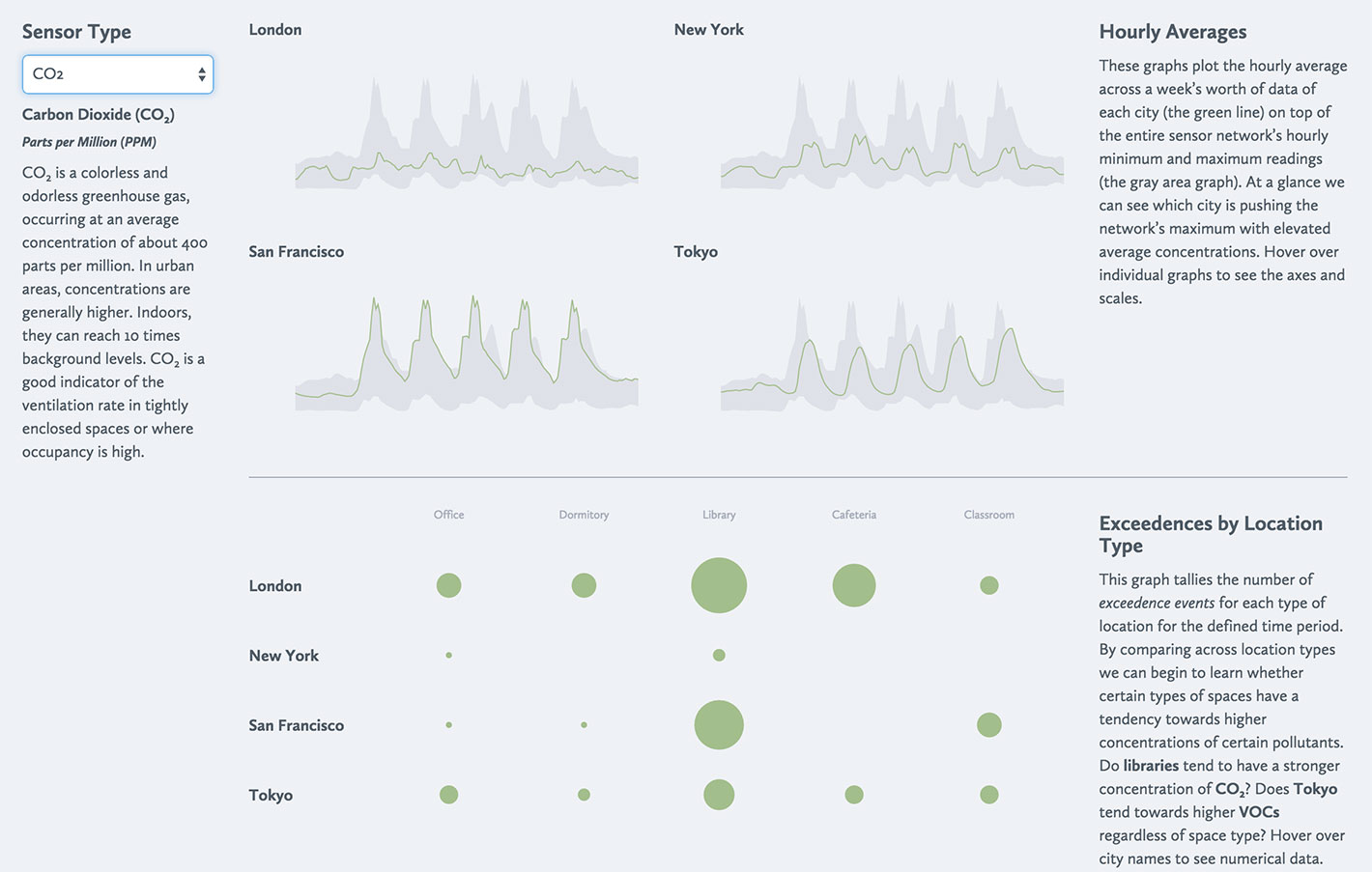
Visualizing Air Quality
An abstraction of the type of work I've been designing and developing for my current startup. By producing weekly reports for our global sensor network, we can place a city in the context of the whole network.
Challenge
Creating visualizations that help understand whether policies or tactics particular to a specific area has an affect on hourly averages, number of exceedence events or hours of the day that may have higher concentrations of a pollutant.
Approach
Developed a system that produces weekly reports for our global sensor network, allowing cities to be placed in the context of the whole network.
Impact
The system helps identify patterns and trends in air quality data across different cities and time periods.
Technologies & Methods
Related Projects
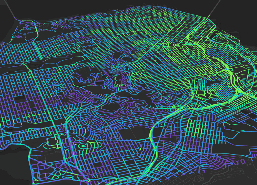
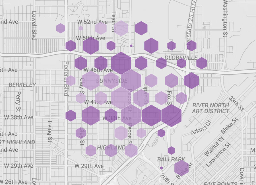
Aclima Pro
As VP of Product at Aclima, I led the development of a revolutionary browser-based spatial air quality analysis platform that transformed traditional point-based analysis into real-time spatial pattern recognition, securing major contracts including $12M with New York State and $5M with the Bay Area.
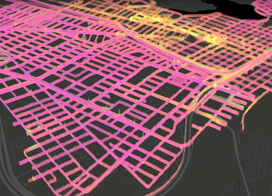
Aclima Visualization Work
As Vice President of User Experience at Aclima, I lead and manage teams of designers, developers and data scientists to develop visualizations and tools to make huge amounts of environmental quality data actionable.
Aclima Insights 2015
I helped to design and develop a microsite to support an announcement of Aclima's partnership with Google in which we install our air quality sensing network on their fleet of StreetView cars to map the air quality in cities.